Friday, 31 January 2014

Where am I now? (Study Task 4)


tl:dr version in .pdf:
10 things that you have learned about yourself as an individual and as learner. These should reflect your personal development and individual journey since the start of the programme.

.Since the beginning of the semester I have better appreciated that the group shares common issues with procrastination, for example, I tend to play video games (Team Fortress 2) exorbitantly.


MrComrade

.Unforeseen events are inevitable, but can be dealt with through flexible time management.


Makani

.I find that I am most productive earlier in the day, and generally become more lax around the lunch hour, and then gain momentum toward 5pm.


Paul Lee

.The creative process is susceptible to doubt and fatigue, which can be tackled by investing emotionally into a project.


Heather Hudson

.Previously, I had the habit of underestimating the time allowances required to produce work.


Gary Larson

.Planning in advance by the hour clarifies the workload.


.When collaborating or discussing, I find it easier to talk to a crowd, rather than say, one-on-one.


Eric Peterson

.The choice to live at home this year has been frustrating due to travel demands, luckily I have now booked student accommodation a short walk from college.


ukbus

.During a short part-time job manning a pop-up shop, I learned that drawing to alleviate boredom is most productive.


One of the many drawings from a six-hour shift of no customers

.Consciously listening to music distracts from the working process (a playlist will tempt me to skip songs), while listening to the radio will allow me to focus better.


10 things that you have learned about yourself as an illustrator. These should reflect your growing awareness of your own interests within illustration as a subject, discipline and profession.

.I thoroughly enjoy using the brush-based mediums on a larger scale, it allows me to explore more gestural lines, rather than my usual methodical fine-liner or biro work, additionally, once I have stopped using biro so much I realise that I do not miss it.


.I wear through drawing medium far too quickly due to the amount of pressure I apply to the page. 


.I find that I am more objective (and cynical) in regards to my personal interests since engaging in the context of practice module.


Kate Beaton

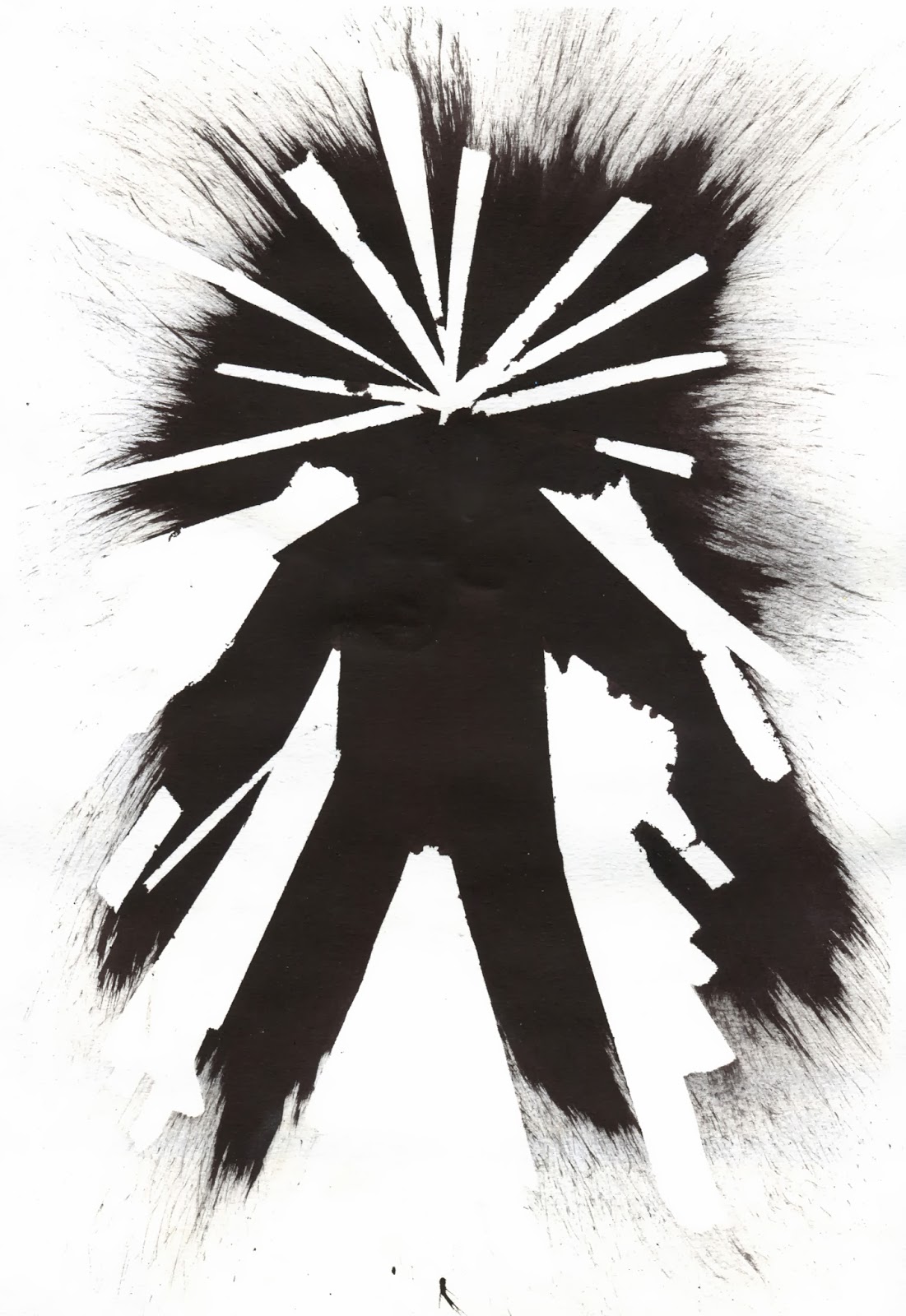
.Collage can be used to create subversive themes of humour and horror (and to a further extent, there is a fine line between humour and horror).


.Repeated studies of reference builds a personal confidence in drawing, and a more expansive catalog of spontaneous drawing.


.I find that I am never utterly content with any resolution, and there is always room for improvement.


.Less successful illustration and practice no longer dents my pride to the extent that I rip out pages, now I tend to repeat the product until it vaguely works.


.Photography is a great supportive asset of drawing from life, it allows later visual responses to become more informed and closer to what I would define as good.


.The digital side of illustration should be regarded as another tool, not more or less valuable as analogue forms of production.


.I am somewhat closer to understanding my intentions of being a professional, in that I aim to avoid producing exclusive and purposeless illustration.


Wednesday, 29 January 2014

What is Illustration? Part 2 (Audience: Subcultures)

Audience - Subcultures: Steampunk & Retro Futurism etc

Steampunk literature began proper somewhere toward the end of the 19th century, populised by writers such as H.G. Wells and Jules Verne. It's popularity has grown since, and is often perceptible in popular culture.

The vast majority of Steampunk illustration tends to be concept-driven, often appropriating familiar designs with 19th century aesthetic, and generally relies on the subversion of well-trodden material (See Steampunk Star Wars).

To conclude for the sake of brevity, it is an anarchic movement which frequently values form over function in response to the mainstream infatuation with 'dry minimalism'.


Charles Harbour

This book cover successfully summarises the whole sub genre; with the golden and bronze palette, the dense frame of valves and pipes and the nods to art deco. The composition is balanced and vaguely symmetrical, with the ornate title  making use of noire-like type face.


Ben Lo

This concept art was developed during the creation of Bioshock Infinite, I would define it as illustration as it carries the purpose of informing asset creators and game developers to the intended tone, atmosphere and sense of space that the project aspired toward.


Keith Thompson

Illustration often enjoys strong ties to literature, this series of illustrations by Keith is no exception, they provide fictitious technical drawings of elements from the 'Leviathan Trilogy', they show high quality draftsmanship which supports the fantastical nature of the imagery.


Hayao Miyazaki

I could have taken a screenshot of any part of the film Howls Moving Castle, but it was this initial design by Hayao summarises the chaotic mess of architecture and technology which characterises the titular castle.


Kate Beaton

In this short comic, Kate explores the fundamental hamartia of steampunk; that the vast majority of the material out there is saturated with functionless decoration.

What is Illustration? Part 2 (Context: Commercial)

Context - The Commercial

It is important to appreciate the mass of illustration which has been devised to convince the viewer, whether it is a generic product or an ideal.


Michael Wandelmaiel

This promotional poster for a literature and music festival subverts the hapless Red Riding Hood imagery, the thin linear detailing is emboldened by the rich colour contrasts of back and fore-grounds.


Adam Haynes

Adam created a variety of promotional illustrations for a Nike advertising campaign, several of which figuratively put the viewer 'in the shoes' of a Nike wearer... as it were. I rather think the sense of vertigo, danger and adrenaline is successfully captured in this warped imagery, the colour scheme refers to the palette in-cooperated in the product's design.


John Malloy

A grand example of illustrative product design, each of the several designs (for each flavour) refer to historical peace movements, thus associating the brand with pacifism and the campaign for nuclear disarmament. The design is astonishingly detailed in spite of the limitations that printing on aluminum presents. Contrasting linear outlines have been used to separate dense areas of detail, thus preventing a 'visual noise.'


Brian Edward Miller

This large illustration was conceived as part of the mildly sinister sounding City of Boulder's "Transportation Master Plan". The full print is somewhere over two metres long, and was stemmed from extensive visual reference and familiarity with the landscape.


Dani Blázquez

This handy .gif shows the process involved in creating the final print...
The work was commissioned for the Bottleneck Gallery as part of a show called 'It came out of 1984'. It frustratingly blurs the line between commercial illustration and promotional art (assuming there is a difference). On one hand it communicates and promotes the themes of 80s popular culture involved in the show, while it exists to be bought as commerce. Regardless, this is simply a great example of the processes applied by Dani.

Sunday, 26 January 2014

Visual Narratives: Module Evaluation

Initially in this module I sought to cover a variety of research methods. I found that non-visual responses to the environment such as observational note-taking and fact gathering were most effective in highlighting avenues of personal interest. I found architectural history most intriguing, as I initially hoped to focus on the supposed secret floor of the Royal Armouries, or Otley Courthouse. I found it challenging to produce large volumes of photography, this however lead to creating collages which I felt suggested depth of space to a greater extent than any singular snap-shot. I did not struggle with producing large quantities of raw data, it was the developmental stages that brought confusion and a rapid succession of directional changes. Paradoxically, I think that this early conflict of ideas resulted in a project that I was more passionate about, once I settled on the concept of Bramhope tunnel I became enthralled by the history of the structure.

Through the developmental stages of study and source material generation I have formalised my process of character and narrative design. The latter of which was structured by the use of story-boarding and miniature thumb-nailing, this not only allowed be to test ordering but also the actual framing and layout of each scene. Storyboarding also allowed me to combine the factual information that I had gathered through historical literature, and the visual material I had created from contextual reference material.

Though I have briefly referred to practitioners during the project, I now find that there were a hoard of illustrators which were highly relevant to my book, and thus regret not spending more time applying what I have learned through my PPP investigations.
I have become quite familiar with fine-liners, and during this project I have strived to involve other materials, such as charcoal and coloured brush pens. But primarily I have discovered a new method of Photoshop manipulation which I had not considered before, by using the channels I can now change the colouration of any monotone linear drawings.

I was initially quite liberal in applying structured time expenditure. And though I am content with the quantity of research and development, perhaps a consistent attention to time would have resulted in a much larger variety of testing and quantity of material. In the last three weeks of the project I used my diary to plan time usage, which resulted in the completion of my project with time to spare for documentation and the alleviation of stress, thus serving as a testimonial for time management, which I shall continue in future.

I rather think the book is successful, and it was generally well received, but it was not without numerous faults in execution; the trimming resulted in distress to the back cover, the typeface contrasts poorly against the archaic themes and the colouration is inconsistent. I am not entirely content with the highlighting, as it appears to strong, and perhaps a lower opacity and improved brush texture would have resolved that.

Sunday, 19 January 2014

What is Illustration? Part 2 (Function: Character Design)

Character design.


Dhabih Eng - Valve (Team Fortress 2)

Dhabih is probably best known for his production of concept art for Vavle, this example shows near-finalised designs for the Scout character from Team Fortress 2. What most astounds me is the perseverance of development, as shown in this blog post, the production faced broad changes; http://www.teamfortress.com/post.php?id=2195


Matias Tapia - Gearbox  (Borderlands 2)

Similarly, Matias created and extensive catalogue of character development, the variety costume and facial features certainly sell the distinctive individuality of characters which often lacks in video games.


Bjorn Hurri

The Steampunk Star Wars collection is devoid of a final intention, and thus appears in the perpetual development stage. The works were created with a passionate devotion to the Star Wars universe and steampunk genre. What I most admire about the pieces is the point of abstraction from the source material. Instead of simply adding gears and valves to existing designs (all too common in the steampunk world), Bjorn has worked from th ground up, creating truly unique interpretations of familiar and well trodden ground.


Ralph Mcquarrie

Ralph was a powerhouse of designs which now dominate the popular culture of Science Fiction. His designs stem from a extensive knowledge of more earthly technology, having previously illustrated for dental firms, Boeing and CBS news. He pioneered the less glossy 'used future' aesthetic, his designs aren't fantastically utopian, they are of tangible wear and tear.


Peahart - Pierre-Antoine Moelo

Like Ralph, I have no doubt gushed about this illustrator before. Pierre's primary focus has recently been on character design, it is interesting to see his digital work become heavily influence by his life drawing studies, which has greatly improved his unique characterisation of the human figure.

Friday, 17 January 2014

Time Management: Daily Diary

In reflection of the time management workshops I have began to use my diary more extensively, rather than relying on the fallible method which involves raw memory.


Tuesday, 14 January 2014

Time Managment (Part 2)

During this session we collaborated in modestly sized groups to investigate how we spend our time.


 This shows the large volume of time expenditure that we expect over the next following weeks.

To divide how we spend our time we used three primary subgroups; Academic, Domestic and Social.


We also listed the top ten events which cause distraction and disturbance from our usual routines.
 I found this task quite enlightening, it proved that the majority of distractions are in-fact inevitable, while procrastination is entirely avoidable. In addition, it was reassuring to learn that the majority of students share common issues with time management. I hope to maintain focus on tasks by using a post-it note list system, as well as action planning.


Monday, 6 January 2014

Time Management and Academic Year's Resolutions

During today's session we discussed the benefits of time management. It transpired that the majority of students find that distraction and disorganisation is the largest cause of missing time.
As an effect of the discussions and workshop I hope to vastly improve how I manage my time, starting with a record of time expenditure.

We also made five academic resolutions for the year ahead I chose the following;

.Use the college facilities to a greater extent, particularity the digital portion
.Remain in college later, rather than taking work home to complete
.Read a wider breadth of magazines and websites to fuel my PPP
.Draw casually more often
.Organise my tools and media to a higher degree