Thursday, 31 March 2016

Student Ambassador: Easter School [Day Three]

This session was based around the use of the heat transfer printing process. The students really enjoyed the session and I had a good opportunity to float around and be generally helpful.
I did manage to print some desings, which are obviously based on Mondrians paintings, I also made use of a UK-Chinese newspaper that I recieved from a fine art student.


 The patterns are surprisingly vivid in the flesh, I will be sure to appropiate them as textures for my work in 603.

PPP3: The Engineering Colouring Book: Analysis

Having completed the project I have had time to reflect on it's successes and areas where there may be room for improvement.
Working with Kerry was a good experience. While other clients have often existed in the uncertain realm of email exchange, Kerry was conveniently located across the road at the Engineering Faculty, and therefore could pop over at and talk to us.
As a group of five illustrators we produced educational illustration, which has since been sent to schools around the country.
I distinctly recall the mixed bag of educational illustration during my own schooling, and I am certain that some imagery must have had a profound influence on me considering my current disposition towards informative illustration. I would like to further pursue it as an industry, and I will be given to opportunity as Kerry plans to produce a second activity book. In the meantime I will take a look around where one might find a job producing diagrams for textbooks etc.

Wednesday, 30 March 2016

PPP3: Logo [Final]

I developed this logo using the polygonal lasso tool, it seemed like I was getting too caught up with overly-comlpicated desings. If a logo can be made using the lasso tool, that's surely a good sign that it's clear and minimal.

I am satisfied with the result, and the additional detailing of the pen and pencil may be removed for a even more minimal image.

PPP3: Secret Seven Smashing Success!

One of my designs has been accepted by Secret Seven, which is splendid.

Student Ambassador: Easter School [Day Two]

Today's workshop involved a life drawing session. The model struck poses that followed on from the themes associated with the work of Kaws; awkward postures that were reminiscient of grumpy or shy children. There were a variety of quick warm up tasks that challanged the individuals methods of working.

 As usual with life drawing exorsises, some images took under five minutes while others took around an hour to complete.

 The line drawing above was performed without free movment of the arms, instead we had to move our bodies in a psuedo-dance-like fashion.


I enjoyed the chance to join in the session, as I have not done life drawing for over a year. I feel as though my working practice has vastly improved, and I was a lot more open to trying varied methods of reference drawing. Perhaps I was also much less concerned with accuracy... which paradoxically seemed to make the anatomy easier to convey.


PPP3: Chat with Nick Scurfield

I recently contacted a local illustrator, Nick Scurfield. My initial interest was based on the fact that he had managed to get some of his designs licenced as official Star Wars prints.
On further inspection I was impressed with the sheer variety present in his work, as well as his expansice experience. I sent over a few questions and recieved an amaingly thourough response:


Me:
Firstly, could you describe your practice, who are your main sort of clientele?

I was wondering how you got licensed to produce Star Wars artwork? I recently completed my dissertation about Star Wars merchandising, so I am certainly interested in producing official artwork for Star Wars.

Are you represented by an agency? How do you find work?


Nick: 'OK, so I did a degree in arts and design and pretty late on decided I'd like to enter film production. In 2000 I did a couple of free gigs to try and get some experience, creating storyboards on a couple of films that never finished production. After a few months I landed a job storyboarding and concept art for a studio who were creating their first animated TV series. I worked on 3-4 shows over a couple of years until they eventually went under (loong story).

I then started scouting out for freelance work, and secured the odd bits here and there before getting a permanent position as concept artist at a games studio in Leeds. I was there for about 4 years and was taking on the odd freelance contract at the same time. They went under (it happens more than you'd think) and so i was forced to go freelance. I decided that I wanted more control over my work and made a concious choice to stick at it and have been working at it ever since.

I'm now working a sort of permanent freelance contract with a games studio in Leeds called Dubit serving as their Art Director and taking other jobs when I think I can fit them in.

The Star Wars work came out of research I did about the legalities of selling fan art. Basically I couldn't find a solid answer but did discover that ACME archives hold the licence for several studios. So after my initial Little Lukes Destiny image got a lot of publicity online, I submitted it and they liked it enough to licence it and put it out as a limited edition print.

With fan art you will NOT make a living from this. I do it for the love and for the publicity. You barely see any money as they only issue about 12% of the sales royalties to the artist. What it does afford you is publicity and will drive traffic to your sites as it does get shared and reposted all over the place, especially if you're pro-active about sending and posting it to as many sites, social-media groups and twitter feeds as possible.

Games studios are pretty much your best bet for work as they're plentiful and are regularly developing new projects. Advertising agencies will also be a solid source of revenue as they have a fast turn over for projects...


Me:
I am really interested in working for games studios, do you have any suggestions for structuring a portfolio to show to game developers / art directors... what do you like to see from artists?
Often it seems a lot of game artists fall under a sort of house style of hyper-real digital paintings.

I will certainly look more into advertising, as it's where all the money seems to be.

Funny you should mention FX, I rescued 20-ish editions from our college library, as they were going to be thrown out (CDs were all intact)!
I do find it encouraging that there are practitioners out there like you who do manage to make a living from illustration (and seemingly enjoy it), and you have really given me some great answers.

One last thing, do you keep a sketchbook, or do you work completely digitally?

Nick:
Sketchbooks. Yes. Religiously. I have about 30 full ones on my desk. I go through about one every 2-3 months. I keep them for reference. But I draw a lot. Whilst watching TV, when I'm on public transport etc, so I try to keep it at hand. I almost always scan in these doodles as a starting point and this is despite having a cintiq. Most of my colleagues seem to be happy to work purely digitally, but for me nothing is close to replacing the feel of the paper. Yet.

The smaller games studios are primarily making products for mobile (ideally that they can release on multiple platforms), which restricts their products to low-poly 3D or stylised 2D art. Whilst its great to see that someone can produce gritty images of urban warfare and realistically rendered post apocalyptic scenes, they don't help when you're making buzzy bee 12. Target your portfolio accordingly. If you're applying to a studio, look at their previous releases and get an idea for what they might be working on next.


Its surprisingly uncommon to come across someone who has a strong grasp of stylised character work. I think this is down to the fact that people who want to work in games set their sights on concepting Fallout 12, where as someone who is comfortable producing characters for small comic strips wont often apply for games, assuming the studios are looking for someone do concept Fallout 12.

There's different areas of design within the games industry, but smaller studios will want people who are good all-rounders. If you have any experience in sound, motion graphics, UI, 3D modelling or Animation, these will always count towards you. Make sure this information is visible early on in showcasing your work.

Your site is pretty nice at the moment. There's some good stuff on there and you clearly have your own style. One thing I'll suggest is to try keep the bar at the top, on screen, even if you scroll down. When time is short, the ability to click to a different category without scrolling back up through a dozen images is always going to be helpful. With that in mind, possibly consider reducing the size of the title box in order to accommodate more thumbnails earlier on. The quicker art directors get to your art, the better for everyone.

Dubit are well stocked with creatives at the moment and have a couple of regular freelancers to hand when they have any overspill but I'll keep your details to hand just on the off chance.


Tuesday, 29 March 2016

Student Ambassador: Easter School [Day One]

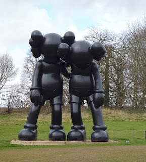
 This first day of the Easter school is comprimised of a trip to the Yorkshire Sculpture park to see the Kaws exhibition. The weather was uncharacteristically good, although it did hail for a minute or two. As a group we discussed the postures of the figures, and how they seemed similar to that of awkward children or moody teenagers. There was also a sense that the poses were often delibertely composed to suggest the chracters were 'aware' that they were on exhibition, as if some did not like being stared at all day in a field.


In this image all three strangers make eye contact with the camera.


We also visited the Bill Violo exhibtion, which was amazing. The video installations were part of a maze of pitch black rooms, which inhanced the effect of the sound and light being used. The high definition sometimes created the impression that they were windows or live feeds of something that was presently happening.

(Much darker than this)


Saturday, 26 March 2016

PPP3: Thought Bubble 2016 Table Secured!

This year I have booked a table with Hollie Smith, and I am pleased to say that we have been accepted. We will indeed exhibit at Thought Bubble in November, which is pretty groovy.
This will be the third time thta I have exhibited at Thought Bubble, and the first time without my old partner in crime/illustration Becky. We both felt that we had moved on and wanted to try something new. So the table will not be themed around the X Files this time around.

Sunday, 20 March 2016

PPP3: Engine Logo

This image is rather like a previous logo, in that it focusses on a Radial Engine.
I'm not sure if this misleadingly conveys that I am an aircraft engineer. This sort of logo might appear on cards, avatars or invoices.

Compared to the previous version, I think it may be weaker, from a distance the type is less readable... should the text 'AAAB ILLUSTRATION' be the primary element of the design?

PPP3: Logo Type

My current logo is composed of all-caps Gill Sans composed in this format:

AAAB
ILLUSTRATION

This seems reasonably legible, and reduces the amount of space required for the text, otherwise AAAB ILLUSTRATION would take up too much horizontal space.

I have also tried some hand-drawn variations:

It is relatively easy to replicate the Berol line quality using one of Kyle Webster's brushes, which also eliminates problems presented by rough edges. It also makes it easier to scale and recolour.


This text may work with hand-rendered pattern:


PPP3: Logo / Business Card Ideas

I have been searching around for imagery that might catalyse a new logo design for my 'brand'. My previous logo was a recycled design from last year with some words slapped on, I'm sure I can do better. Follow Adam's board Symbol/Component on Pinterest.

Thursday, 17 March 2016

PPP3: The 2001 File


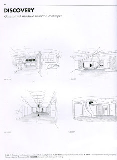
This book recently appeared in the library, which was lucky; if it had appeared some month previous, I might have been convinced to write my dissertation on the art design of 2001: A Space Odyssey.


The development of a science fiction film requires in-depth world building, the book documents a huge wealth of developmental drawings that were used to create totally original spaces. Images take the form of diagrams from multiple perspectives. There are both line-based detailed images as well as more formal paintings.

 
The imagery is based on pratices of interior design, the lines are controlled and clear. This is reflective of the tone of the film. The environments we see humanity in are laboratory-like, and removed from natural comforts. The chracteristics of the principle cast are as robotic as the HAL9000 antagonist.

The Hyde Park Picture House is certainly not an ultra-futuristic spaceship. It stands to reason that I need to avoid completely sterile diagrams. I must better inform my resolved work by my sketchbook. I have often produced two forms of work, the gestural work that had a good sense of immediacy, and the highly digitised work. The final major brief is a chance to bring the two aesthetics together.

PPP3: Vote Adam for President - Success!

Results for the elections were hosted at the Belgrave, the event culminated with the announcement that the students had elected me as their next president (hurray!). I was pretty darn happy about the result and had a good chat with some of my future officers. They seemed pleased about the result and I am confident that next year will be a grand experience. I have been assured that I need not worry too much about the role until after I have graduated, so that I might concentrate on my studies.

Wednesday, 16 March 2016

PPP3: William Grill's - Shackleton's Journey


I discovered this book in Salt's Mill. It's fantastic. Grill has an obsesive attention to detail, trivia and objects. I find this highly useful for my own ventures with the Hyde Park Picture House.


I particularily enjoy the visually arranged lists of people and objects. The limited palette and restriction to colouring pencils creates a strong flexible aesthetic, it applies just as well to diagrams as it does to narrative-driven pieces. Perspective is used effectively for clarity, showing the same items from multiple angles. Negative space is especially used well to represent the snowy wastes.


I am particualy inspired by this book, I am encouraged at it's method of story telling, absent of traditional pannel, and capable of flowing effortlessly from maps to item cataogues and to scenes full of movement and character.

After my tutorial, I realise my recent work has lacked this vibrancy, and has often been cold.
Perhaps investigating a wider range of materials, format and composition will bring about better results.

Tuesday, 15 March 2016

PPP3: Engineering Colouring Book Launch Event

Saturday was the launch event for the Colouring Book, the event took place in the Leeds Trinity Kitchen, towards the back of the room. Kerry had been worried that the event would either be deserted or overwhelmed, however as it turned out, the visitors to the event were just about right. The maximum amount of people colouring in at any one time seemed to be 6-8. These people were usually chidlren accompanied by their parents.

It did seem that during the gratuitous photography session that crowds were less inclined to participate. This session involved me and the other illustrators posing in various ways infront of thelarge print.

The event was decent in terms of 'exposure', as the colouring books were handed out for free in large numbers, each copy had a list of the contributing ilustrators, which may prompt owners to look us up online.

I took some photos during the event, I will add a second post once we have been given the imagery taken by the commisioned photographer.


Monday, 14 March 2016

PPP3: Ligne Claire Again


Joost Swarte

Swarte is another champion of the ligne clair practice; that is the use of clear line and limited and often literal palette. I noticed his makes use of the isometric perspective, which has drawn me due to my own recent endevours for my final major project. Joost has also designed architecture and furnature, which is evident in the draugstmanship present. Ligne clair is an exorcise in clarity (it's in the name), it allows for large amounts of content whilst avoiding 'visual noise.'


Martin Handford

Made famous for 'Where's Wally?' practices an intense version of ligne claire, chracters are distinct even when rendered at a small scale and even when using a very limited palette. The aesthetic is seemingly used toungue-in-cheak, Handford teases the viewer with repeated colours and simple patterns to make it difficult to actually find Wally. I would certainly like to make use of simple characters in my Hyde Park Picture House project, perhaps from a range of eras to illustrate the history of the building. The 'Where's Wally?' format of alarge-scale book with tear-out pages is certainly applicable to my own project, with additional activities relating to finding hidden objects etc.


Peter van Dongen

Van Dongen has prodcued his own graphic novels as well as responding to editorial briefs. Ligne claire seems like an extremely verstile aesthetic, and may adopt a variety of tones, making it perfect for editorial work. The use of colour and composition may create tension, while the consistent art makes it easy for the viewer to absorb the information at a glance, the depth of detail draws the viewer in further to notice smaller details and implied narratives.


Wednesday, 9 March 2016

PPP3: Vote Adam for President - Ephemera


The spaces reserved for posters have rapidly depleted around college, I had responded to this by creating a small A5 card which has the main points of my manifesto as bullet points. I have since noticed a spelling error; the lack of an appostrophie in 'Lets'.

As well as the card I recylced an old concept from 502; while the A5 cards occupy space between the larger posters, this small cut-out may be placed on ledges around college without damaging the walls (some students have taken to pinning work directly onto random surfaces).
The campaign has been visually impressive, and hopefully will draw intrigue, or at the very least get students to remember my name and face. I don't think printing the manifesto or indeed any large bodies of text would have been effective, as most people will pass these posters fleetingly and go about their day.

Tuesday, 8 March 2016

PPP3: Vote Adam for President - Posters

Some time ago I was making the weekly visit to the Student's Union to print copies of the Film Society posters, Emma and Kaitlyn suggested that I should run for president. Honestly, I hadn't really thought about it until then.

I have since launched my campaign, which involves a variety of posters and promo.
Unfortunately, the actual campaigns week coincides with a bunch of other projects, so I feel as though I could have put a lot more effort into the campaign, if only there were more hours in the day.

This poster was completed by Emanuel.
Thanks Emanuel.


This poster was completed by Zatul.
Thanks Zatul.

Thursday, 3 March 2016

Visting Professionals: AOI Lecture

We were invited to attend this session conducted by a representative from the AOI, Lou Bones.
The lecture was extremely informative, Lou gave us an extensive explaination of the benefits of joining the AOI.

I was aware afterwards that many of the things Lou advised us not to do, were indeed things that I had done, and learned not to do the hard way.


Lou advised and discussed some good key points inlcuding:

. According to Lou, social media must either be done well, or not done at all. Those who do not frequently update their media outposts do not reap the rewards of online prescence

. She advised us all to avoid trends, as these are an unsustainable method of inspiration... specifically mentioning the amount of orange and blue colour schemes that have been used recently

. NDAs must always be respected, or else legal problems will ensue
. Keep all relevent paper work from any job...
. Be direct with contacting, do not write generalised templates and send them... there are generally obvious to the recipient... For example do not address people as sir or madam
. Many creative directors will have a pin board of work that has been mailed out, so it is certainly not futile to send out mailables
. Send frequent post-card sized (A5 is generally the maximum) mailables and promo packs
. Follow up contacts with .pdfs showcasing work

. Sign up for income tax asap, keep all reciepts... Luckily I am familiar with filing tax returns as I completed them for three years for my sisters business
. All contracts must be formalised as writen documents, verbal contracts are fubar
. Illustrators have the right to negotiate contracts
. Obviously be sure to read contracts thouroughly
. Do not work on an hourly rate
. Final payment should be on delivery of approved artwork

Advertising commisions vary depending on the size and reach of the business...
. A 1-year UK license for a large snack company (including print and digital medias) might cost around £6000-£7000
. A small branding-based job for a small local busniess might cost around £200-£300

Packaging commisions can pay extremely well for huge clients, Lou mentioned one commision was priced in the tens of thousands for hair spray packaging and additional branding.
. Spot illustrations for supermarket packaging may range from £400 to £500
. Larger international brands such as a drinks company may pay £4000 to £5000

. Illustrating a internationally released picture book for example may price around £4000-£5000
. Adult fiction book covers may cost around £800 to £1000


...

So the talk was extremely informative, and I will join the AOI to make use of futher support. The formal advice is very specific and certainly useful, to cost of joining also includes the subscription to Varoom, which is a good bonus.