To summarise my current position as a practitioner; I am an illustrator that specialises in technical and clear imagery with the purpose to inform, educate and explore concepts. The practice is based on an exhaustive sketchbook practice. I currently engage with commissions that appear in museums and children's educational materials. I intend to expand upon this, working with more clients in these specialist areas. I would like to build a portfolio that is more specific to editorial, as I believe creating imagery for frequent articles is an excellent exercise in concept and rapidity.
I have recently been elected as the Student's Union President, this is a full time job shaping the future of the Union. The job will involve many facets of PPP, such as communication, presentation and professionalism. Being president will an excellent opportunity to gain experience and ensure the Union continues to support the students and create opportunities. In addition, the position simplifies various issues, as I will be able to access resources for another year. This will help my intention to continue selling prints at festivals and fairs, and set up an online shop. Of course, I will continue to research print resources beyond college. Being President seems like the natural progression form being a Student Ambassador and Society leader. My initial task is to avoid the full time role from distracting too much from my practice, I must find time to produce illustration and engage with clients and competitions.In the far future I must consider whether I truly intend to continue into education, as it seems like a commonality throughout the last few years of development. I enjoy teaching, tutoring and generally assuming leadership roles.
To conclude, I will have a full time job as Union President, allowing me to improve my leadership and collaborative abilities. I will continue to use the college facilities to push my work in print, and sell limited editions at fairs and online. My work in informative illustration will continue until I have a good portfolios worth to bring to more clients, meanwhile I will participate in competitions and complete editorial illustrations that will hopefully result with a regular job in editorial.
Thursday, 21 April 2016
PPP3: Summative Evaluation
As the final PPP module after these three years, this marks my progression from full time education to the world of professional practice. Throughout the module I have continued to investigate my practice and how it relates to professional careers.
I have continued to establish my web presence, including a website and the various social media outposts. The site acts as a central hub with a gallery that may be regularly updated with recent work. An online presence is most successful when updated regularly, this has proved difficult as I have frequently prioritised my academic documentation. Although I feel as though recent engagement has been much better. The website itself requires some improvements, the addition of a sticky menu would allow users to easily access links when scrolling down, but otherwise I feel as though the design is simple enough and does not distract from the imagery.
I often use Facebook and Instagram to upload imagery, and can extrapolate how well work is recieved based on the response. Both platforms have around 100 followers, and many of those are admittedly relations and friends. The Facebook page did indeed lead to the Redman Design commision, so that is a good mark of success. I realise however that I must work harder to engage with my audience and attaract more visitors to the website.
The current branding reflects a more stripped back almost corporate aesthetic, this again allows for a focus on the contained imagery. The logo has developed from a convoluted design into a far more appropriate icon, admittedly there is potential for further simplification. The promotional pack is an A5 wallet that may include postcards, business cards, CVs etc. It is small enough to mail out to any clients or agents that I have a specific interest in. I have not mailed the pack out to any practitioners, which I would suggest has been a detriment.
I have continued to contact practitioners, and their responses have informed my development. Combined with talks from visiting professionals I have gained a much better understanding of what I can expect from the illustrator profession. My contact with Redman Design has led to frequent commissions for museums, and has introduced me to the informative design industry. Working on the Engineering Project also made me further explore the role of illustration as a teaching material.
Towards the end of the year I was elected as the President of the Student Union. This is a full-time paid job, running the Union at Leeds College of Art. Having already deligated at the NUS Conference, I am aware that is will be a grand task, and it will be a challange for me. I accept however, that I will enjoy being president and I welcome the opportunity to improve as a professional. The role seems like the natural progression from my work as a an ambassador, and my small ongoing work with the union.
My engagement to the module has been good, I feel more confident as a practitioner and generally feel far more informed. I have established a brand and engaged with clients in a professional manner. Were I to repeat the module, I would certainly contact more practitioners, publishers, agents and art directors, although this is certainly an ongoing investigation and will continue after graduation. I would have also liked to focus more of my PPP around education and public sector, as this seems like the inevitable direction of my profession. I understand however, that my role as President will
develop my relationship with education, and give me a great insight into the internal workings of FE and HE education.
PPP3: Portfolio
The imagery seems like a good representation of my work, it is easy enough to swap out images depending on the client. The selection will not involve any more than ten images (unless specifically asked for). I have not added extraneous graphic elements, as they would only distract from the images.
PPP3: NUS Conference 2016

As the newly elected President (although my term has not yet begun) I was sent as the Leeds College of Art deligate to the NUS conference in Brighton.
The event was gigantic, we queued for about 40 minutes for registration, in time for the start of the conference. Initally the conference seemed surreal, it was weird being sat in a hot room amongst around 800 deligates and observers in a stadium-sized theatre, voting on things that seemed abstract. I chose to avoid too much of the campaigning and based my decisions on the clarity of speeches. I was proud of the diversity present at the conference, a good range of every race, creed gender etc. It became obvious that the union is heavily left-wing, and a lot of disagreements seemed to be based around syntax. Voting was carried out by raising one's voting card, when votes were close each raised hand had to be systematically counted, which took around 10-20 minutes. Apparently there was a digital voting system trialed a while ago, and it resulted in a lot of technical issues.
I enjoyed the process, although I was astounded by the amount of rather vicious exchanges on twitter. As I was deligating on behalf of the Student's Union I updated the twitter a few times... which was a bit of a pandora's box as I realised there was a world of personal attacks and labelling going on beyond the already tense atmosphere in the conference. The amount of media spin and drama about presidential candidates and the eventually elected President was also bizzare to witness unfold live. I was attending a news story as it happened. Thrilling!
Sunday, 17 April 2016
PPP3: Post Presentation
The two days of presentations were exhausting, but I really enjoyed listening to each student summarise their journey over the last three years of the degree. We have all braved to course together, and there was a real sense of camaraderie. I was a little nervous about my own presentation, although as soon as I stood up and started talking I felt comfortable.
The feedback I received was positive, I was praised for my professional presentation style, and it was remarked that I had improved since previous presentations which were perhaps awkward. The tutors suggested a career in education may be a good route to traverse, which I have indeed thought about quite a lot. It is an agreeable idea, even if both my parents are teachers and have thus told me every terrible story about teaching, and have frequently complained about the government's attitude towards art in education.
The feedback I received was positive, I was praised for my professional presentation style, and it was remarked that I had improved since previous presentations which were perhaps awkward. The tutors suggested a career in education may be a good route to traverse, which I have indeed thought about quite a lot. It is an agreeable idea, even if both my parents are teachers and have thus told me every terrible story about teaching, and have frequently complained about the government's attitude towards art in education.
Saturday, 16 April 2016
PPP3: Chat with Nigel Sussman
Nigel Sussman (not the politician) is a mural artist, illustrator, art director and designer. His complex compositions are born from an exhaustive sketchbook practice, which he documents on his blog. I asked him a couple of questions and got a very expansive response.

Firstly, could you describe what led you to your current profession?
You seem to have received a huge amount of commissions from clients, how do you approach commercial briefs compared to, for instance a more personally driven project?
I took a look at your site and I like your style and attention to detail. Nice work!
I also studied illustration in college, but right out of school I took a job in design/advertising because full-time illustration jobs are VERY rare. Also, I was playing bass in a rock band which was taking alot of my time and creative energy, recording and playing shows (of course i did the posters, merch, website, and album covers for our band) I worked my way up to an advertising art director over the years, all the while doing personal projects and the occasional commission in my "free time".
I did this mostly because the San Francisco Bay Area is pretty expensive place to live, and being a starving artist was not something i felt like doing forever.
A few years ago the band broke up due to the lead singer having kids, and I decided that I needed to get back into illustration. Luckily the ad agency i was working for at the time let me have a relatively flexible schedule, so I started hustling and trying to find illustration jobs any way I could. From physically approaching business owners to offer my services, to responding to craigslist creative gigs classified ads.
Over the course of several years, my illustration business steadily got more and more busy until i could not maintain both the full-time ad job and the illustration at the same time. Only then did i quit the day-job and now work in my home studio in Berkeley.
Personal projects always seem to have more "passion" and "spark" in them, that can sometimes be killed by picky clients. It is sometimes hard to inject the same amount of enthusiasm into a project that isnt 100% your idea, and not every job is "portfolio worthy". I learnt a lot about how to mitigate client expectations by working as a commercial designer/art director for 10 years, and there really is no trick besides being very patient. Also, only about 60% of the work that I do gets showcased on my portfolio. Some of it I just wasn't as pleased with, and some of it is good, but doesn't help enhance the style/feel I am trying to create in my body of work. Posting too much of a variety of things can be confusing for potential clients. They want to know what to expect when they hire you. I try to only display the types of things that I want to get more work doing.
- This reflects what I have experienced with my own commercial briefs, patience proved to be pretty key. It was easy to become frustrated, however I rationalised at the time that there was a reason for every decision. I understood that delays are inevitable, and I understood that my creative input was secondary to that of the client.
It is interesting that Nigel has pushed deliberately for work that is very consistent, a great way to show clients exactly what they are going to get.
Best of luck to you in your illustration career! It is not an easy route to take, but if you have the dedication and a bit of business sense/hustle you can get there. My overarching advice would be: Maximize exposure, nowadays you cannot afford to only have a website. you must be active in ALL the social media, all the forums and groups, all the promotion, and all the contests (be wary of ones that charge you up front). make sure you have a good sticker or business card and give to anybody you meet that is REMOTELY interested.
You must constantly be drawing to improve your craft. If you don't have a commission, then create a personal project.
And always be nice to everyone and never burn any bridges. There are a lot of people who can draw, but there are not as many who can draw, are reliable and easy to work with. That is what will give you repeat customers and network referrals. This is a huge part of how a small business like ours grows.
Nigel's response has supported many things I have learned from previous chats, Big Heads and professional talks. He seems to represent the success of illustrators that are extremely proactive, he has sought out work, competitions and has reaped the rewards and is able to sustain a good income from his practice.
Friday, 15 April 2016
PPP3: Chat with Tara Jacoby
Tara Jacoby is an editorial illustrator who has produced artwork for Gawker articles.
Her artwork seems completely digital, it makes use of clean line, shape with subtle textures and occasional animation. I asked her a few questions about her practice:

Firstly, could you describe what led you to your current profession?
Your editorial work has featured in print and online, do you have a preference?
Are you represented by an agency? How do you find work?
I studied illustration at the Fashion Institute of Technology in NYC and while I was there I decided to intern at the Society of Illustrators. That led to a job there and eventually I worked my way up from museum shop, to exhibitions coordinator, to graphic designer. My experience there as the graphic designer along with my background in illustration weighed heavily on me getting hired at Gawker Media. I worked at Gawker for a year and half as staff illustrator/deputy art director, then moved on to Vocativ as their Deputy AD. While I was at all of these jobs I continued to freelance.
I am not represented by anyone and don't plan on getting a rep any time soon. Although, I think reps can be helpful to some, especially if you are trying to branch out to different areas of illustration, like advertising and video. I was emailing ADs and sending mailers int he beginning, but after working at Gawker, people began to become familiar with my work and contact me. Every once in a while I reach out to ADs if I've been dying to work with them, but it's difficult to do freelance and work full-time all the time so I tend to take them on when they contact me. I think it helps a lot to network and go to events/openings. It's a small industry and it helps to get to know the people you want to work with.
I don't prefer online editorial or print. They both have their perks. Digital is immediate, which is great. Print is something tangible you can hold in your hand and usually get a little more time to work on. They both give you a different sense of satisfaction when you see them published.
As for how I work.. It's kind of evolved over the years. I used to ink my work and then color digitally in photoshop. Since working at Gawker, I've had to speed up my process. I eliminated the step of inking (which I miss) and I draw on a Cintiq. Everything is done in Photoshop. My illustrations are usually done within 1-3 hours, sometimes longer if time allows. I don't have much time to work because of the fast paced editorial environment. But I always make sure that my image is conceptually strong because I don't have a lot of time to knock out a lot of details.
That latter point about conceptually-strong editorial is a good observation, I realise it frequently applies across most examples of editorial. As these sorts of briefs involve a quick turn around, there is often a focus on concept over intense detail. Her choice to continue as a freelancer as opposed to being represented seems to give her more freedom to dictate her use of time. Tara is another example of how being proactive reaps rewards in terms of success and employment. Her work has been pushed by short deadlines, making her imagery very deliberate, the concepts involved are generally quite funny.
Wednesday, 13 April 2016
PPP3: Promotional Pack [Final]
I spent today building a promotional pack. The pack is built from stocks available in the library, and printed on using the bypass tray. I am happy with the quality of the print, and I think it is a vast improvement over the previous year's attempt.


Tuesday, 12 April 2016
PPP3: Data Flow
Fred lent me a copy of Data Flow, which upon inspection is oddly familiar so I may have read through it before. The imagery impressed me more so than Mapping, as there was plenty more illustrative work dealing with space and objects.


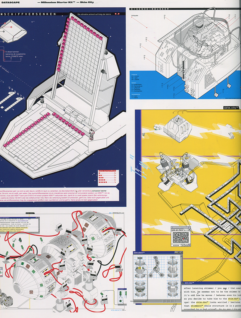
Several compositions involves the isometric persepctive are a common visual language when formalising space.

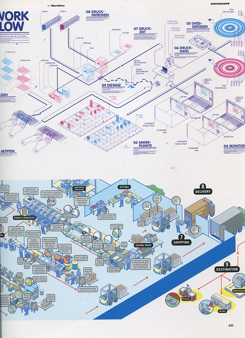
Diagrams are also used internally to brief and educate employees. The isometric illustrations are investigations of components and interior space, elements have been arranged non literally to help the viewer understand a process, action or narrative.
For example: 'How Books Are Made' by Funnel inc. represents the lengthy workflow involved in the prodcution and delivery of books, each stage of production is simplified and confined to one non-literal space.
PPP3: Mapping - An Illustrated Guide to Graphical Navigational Systems
This collection of imagery involves various methods of communicating complex information. The majority of examples deal with raw data; so deal with the challange of converting dry information into something visually harmonious. Fred reccomened this book as it relates to my own investigations of the Hyde Park Picture House.

I have picked out a few examples from the book that seem to deal with spacial and trivial information.


Again extremely limited palette, with overlapping sections of information (would be interesting to see animated).

The book does represent interesting methods of information, particulily in the way information is represented non-literally, and may be represented through the over-lapping of shape, colour and line.
Even the flattest of images represent a certain implied depth, which would suggest that my own project could enter a 3-D plain.
Wednesday, 6 April 2016
PPP3: Chat with Micheal Kirkman
A while back I was reminded that there is another illustrator/artist in the family (not counting immediate relatives who all seem to be creatives), so I thought I'd reach out and ask a few questions:

Firstly, could you describe what led you to your current profession?
Your linocuts are fantastic, what is your studio set-up like, do you operate from home?
You
seem to have received a good amount of commissions from clients, how do
you approach commercial briefs compared to, for instance a more
personally driven project?
- I studied illustration because when I started my art
college training the painting courses weren't into the traditional
crafts, it was all about concept. I opted for illustration as it was
important for me to draw. I then learnt allot about illustrating as a
profession but also developed a interest in printmaking from some
brilliant tutors and technicians.
I went on from college showing my prints in galleries that approached me from my degree show work and illustration work came from people seeing the prints.
I went on from college showing my prints in galleries that approached me from my degree show work and illustration work came from people seeing the prints.
- I work in Edinburgh printmakers to edition my linos. It
is a shared studio space that I am a member of. I also work on paper at
home and oil at a studio I rent about 20mins from my flat.
- I never hunt out comercial briefs or commisions as they
are not my main focuss. They come along from people that see my work
online or in galleries and those folk get in touch. They can pay well
and more importatly they are guaranteed money.
Some I enjoy others can be a pain.
Most of the time I work on my own paintings drawing and prints for group shows, gallery stock and the occasional solo show. This part of my practice makes up about 3/4 of my income.
When I do get commisioned for a brief then I work hard and fast, and ensure the fee is broken up so I am paid for most of the work before the finished work. It is hard to make any money as a artist so you have to take control of any opportunity quick before people lose interest.
I haven't particularily considered that gallery and exhibition work might prodcue a decent income, so I will certainly consider that option going forward. I suppose the print fairs and Thought Bubbe have been a taste of that side of making money from artwork. Micheal mentioned his use of a local workshop to produce his prints, which is something I have been considered doing, as I certainly do not want to sustain a home set-up especially as I will be stuck in rented accomadation for the forseeable future.
Monday, 4 April 2016
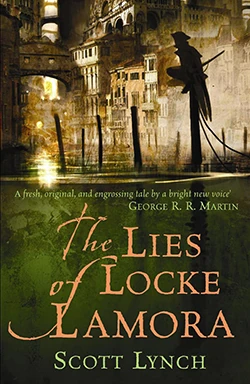
PPP3: Chat with Scott Lynch (writer)!
Scott Lynch is one of my favourite authors. The Gentlemen Bastard books are a hilarious fantasy/comedy/heist/con series with truly vivid imagery and characters... I decided to ask him about how he felt about the large amount of fan-art about his work, I wondered if it indeed affected how he thought about his work...
Hello, Adam--
First, many thanks for the kind words!
Second, I try very hard not to let fan art influence my understanding of things. I know that sounds like an utterly shitty thing to say to an actual illustrator-- but what I mean is that I love it, appreciate it, frequently admire it, and still I try not to let it displace my own intentions or internal vision of how someone/something looks. I'm very careful never to say anything like "wow, that's very close to how I imagined it" or "yes, that looks just as it should" when I'm reblogging or commenting on fan art. As I see it, if I start approving or formalizing the "canonicity" of certain pieces of fanart, I'm doing exactly what I swore I'd never do, and telling everyone who doesn't share that vision that the version of my books they see inside their own heads is somehow wrong. So I strive to approve and enjoy fanart without qualifying its "accuracy" in any way.
I hope that made any sense at all!
Cheers and best wishes,
SL
I am delighted he responded, it's interesting that he actively avoids establishing a canon visual interpretation, allowing for readers to project their own idea of how the characters should look...
PPP3: Leoni Bos
I have been looking around for architectural studies that apply interesting colour schemes and textures. Will showed me some work by Leoni Bos, as he thought it might be relevent. The illustrations are pretty great. A combination of thin architectural line, and heavier line weights to enhance the impression of depth. The colours are a pleasant mixture of primaries and pastel colours which compliment each other very well.


PPP3: CV [Final]

I had the idea to add an illustration of my dissected floating head, but I decided that it would have taken up too much precious space.

PPP3: Look ma' I'm on Google


It's convenient having a unique name, especially when it spells AAAB when initialised as it will generally top any alphabetised list.
PPP3: CV References
Here are some text heavy-ish CVs that I have been taking a look over. Although I want to avoid an all-out wall of text, I do intend to include descriptions of experience and jobs, so that will entail a good amount of text. I am not sure a graphic-design-symbolic-representation of every facet of my being is a good idea... but I have seen some interesting CVs get away with that sort of thing.
Follow Adam's board CV on Pinterest.
Sunday, 3 April 2016
PPP3: New CV Draft [WIP]
Bio
Hello.
I am an illustrator based in Leeds. My practise is based around informative imagery, and composing dynamic compositions based on narrative and technology. The work I create covers a variety of processes such as digital painting, screen-printing and animation. I beleive illustration must be clear, and indeed interesting enough to provoke viewers to think about the subject matter. Otherwise I read a wide variety of science fiction novels and maintain a healthy interest in Lego.
Education
Leeds College of Art
Foundation Diploma
(2012 - 2013)
Leeds College of Art
BA (Hons) Illustration
(2013 - 2016)
Experience
Teaching Assistant
Teaching young and mature students as part of a progression short course; topics included illustration, graphic design and sculpture
Designer (November 2015 - February 2016)
Completed several projects in collaboration with Redman Design that involved producing designs for large-scale museum exhibits.
Illustrator for the Engineering Colouring Book
Contributed several pages to the mass produced colouring book, also designed a large-scale colouring page, which became the centrepiece for a public event in Leeds Trinity Kitchen.
Work
Part-time Floral Technician at Leafy Couture (2005 - 2013)
Many a bucket were bleached, a plethora of candelabras polished (is this relevant... possibly include it for humorous reasons)
Student Union President at Leeds College of Art 2016-2017
Achievements
Helped artist Shane Green design a sculpture based on the Wharfedale Press, it may be viewed in Wharfemedows Park in Otley.
Curated the 'Off the Page' exhibition at Colours May Vary (December 2014 - February 2015)
I have exhibited and sold prints at Thoughtbubble for three years and counting (From November)
Skills
I approach my illustration pratice with brutal logic, sytematically completing briefs with a keen interest in clarity of communication. Sketchbooks are central to my process, and I constantly draft concepts and explore new methods of drawing. I have a passion for screenprinting, and enjoy crafting high quality prints on various stocks.
Hello.
I am an illustrator based in Leeds. My practise is based around informative imagery, and composing dynamic compositions based on narrative and technology. The work I create covers a variety of processes such as digital painting, screen-printing and animation. I beleive illustration must be clear, and indeed interesting enough to provoke viewers to think about the subject matter. Otherwise I read a wide variety of science fiction novels and maintain a healthy interest in Lego.
Education
Leeds College of Art
Foundation Diploma
(2012 - 2013)
Leeds College of Art
BA (Hons) Illustration
(2013 - 2016)
Experience
Teaching Assistant
Teaching young and mature students as part of a progression short course; topics included illustration, graphic design and sculpture
Designer (November 2015 - February 2016)
Completed several projects in collaboration with Redman Design that involved producing designs for large-scale museum exhibits.
Illustrator for the Engineering Colouring Book
Contributed several pages to the mass produced colouring book, also designed a large-scale colouring page, which became the centrepiece for a public event in Leeds Trinity Kitchen.
Work
Part-time Floral Technician at Leafy Couture (2005 - 2013)
Many a bucket were bleached, a plethora of candelabras polished (is this relevant... possibly include it for humorous reasons)
Student Ambassador at Leeds College of Art (2013 - 2016)
Gave tours of the campus, maintained tables at various degree fairs and assisted the progression team as a teaching assistant.
Helped artist Shane Green design a sculpture based on the Wharfedale Press, it may be viewed in Wharfemedows Park in Otley.
Examples of my work has been exhibited in the Otley Courthouse, Travelling Man, Colours May Vary and more recently Secret 7.
Curated the 'Off the Page' exhibition at Colours May Vary (December 2014 - February 2015)
Skills
I approach my illustration pratice with brutal logic, sytematically completing briefs with a keen interest in clarity of communication. Sketchbooks are central to my process, and I constantly draft concepts and explore new methods of drawing. I have a passion for screenprinting, and enjoy crafting high quality prints on various stocks.
PPP3: aaab-illustration.com [3]

I have made some changes to the website, mainly thinning down the images present on the home page. The home page images also no longer link to separate posts on the website, and instead may be scrolled through. I have added a sketchbook section in the top menu, and removed the contact form, instead my email is omnipresent under the logo.
I am currently trying to figure out how to get a sticky menu working; that being a menu that follows the user as they scroll down the image, so they are never too far from accessing another section of the website.
PPP3: Facebook page updates

Twitter seems to be a lot more demanding of content, and I am considering removing my professional self from it... for now.
During the AOI lecture it was mentioned that successful social media interaction is dealt in absolutes, either they are updated regularly, and they drawn in a good audience, or they are neglected and therefore pointless.
PPP3: Email Signature and Letterhead [Final]
Making the signature was simple enough, although for some reason gmail would not allow me to upload an image, only giving me the option to choose an image url. I remedied this by hosting the image on my own site, How useful having a website is!


PPP3: Invoice [Final]

The document may be edited easily, and saved as a .pdf allowing for recipients to select and copy information within the document (for example costings and payment details)
PPP3: Business Card [Final]
So, I have arrived at my final design. The slanted design of the logo means that it can be angled to inhabit more space on the card, which was purely an accidental design feature, but it superficially seems deliberate.


The colours of the front design may be changed easily. The back of the cards involve excerpts from a range of my work, including sketchbook developments and the more polished digital designs.
PPP3: Chat with Nathan Clark
I recently got in contact with Nathan who works at the Delete Agency, I wanted to know more about what it is like working within a larger team for clients. I am certainly interested in this sort of career path, whilst sustaining freelance briefs on the side.
I will be unable to join a studio or development team next year, due to my full time job as a the Student's Union President, however it is important to prepare myself now as I embark on the world of post-grad.
My questions were as follows:
Firstly, could you describe what led you to your current profession?
What are your main duties at the agency?
When a brief comes in, how is work allocated between the team?
When hiring new team members, what do you like to see in a portfolio?
I'm more than happy to answer a few questions for you. I've also passed on the email to my team lead Kev; he's the creative director here at Delete Leeds. Hopefully he'll get you some info too.
So here goes:
1) My background was a bit all over the shop when I first started out. I worked in a Pharmacy and was a support teacher in the design classes.
Design has always been a passion but I wanted the challenge more than anything else. I found that there was a greater range of projects in the design sector covering all sorts of different subjects. The other office jobs I had at the time just seemed more mundane and repetitive which pushed me even more. Being a creative allows you to do something and learn as you go with each project. Briefs change and you evolve your practice, particularly in digital design, to fit around them.
2) I'm currently a Junior Designer but will be pushed up to a Digital Designer position in the next month.
From here I liaise with our client partner team and the client, getting involved with kickoff meetings to get focus on the clients expectations. Then it's a case of digesting their comments and beginning design work which is presented in waves of moodboards, presentations, design wireframes/scamps and then actual design work.
This also makes it easier to talk about during interviews - so prepare yourself for questions!
I also get involved with a lot of our new business credential presentations and internal design projects.
I can often be found jumping between the Leeds and London studio for client meetings too.
3) This depends on a range of factors, primarily its down to deadlines and skillsets. If the deadline is tight then it goes to someone with a decent amount of experience such as a senior to get it out in time to the best standard.
Although as a general approach a senior designer/creative director oversees the project but the bulk of the design work goes to a Junior/Middleweight designer. Communication is key throughout as it always helps to have a second pair of eyes to pull out any issues that may have gone unnoticed.
4) Portfolios should only show the best work. Don't feel like you have to put everything in there. A crafted project with background research and development details is a lot more enticing as it shows us your thinking.
- Excerpts from long considered projects are generally impressive... balanced with quicker responses that turned out well
It's a sad truth that most agencies have very little time to look through portfolios due to the vast amounts of deadlines, so wow us with the best stuff. On a similar note if you're confident do something unique with your portfolio. It doesn't matter if it's digital or physical, something different from the norm will always get attention.
- Agencies and development teams are busy, and have their own long list of worries and deadlines, so brevity is indeed the soul of wit. Come prepared, don't waste their time (or your own).
As we're a digital agency, Delete will look for digital projects first. So if possible cater to your audience with your portfolio.
- This supports the advice I have received from others that I have asked
But if anything be proud of your portfolio! Make it your own little project and spend some time crafting it. I still go back and update mine because it's my own little showcase of achievements.
Thursday, 31 March 2016
Student Ambassador: Easter School [Day Three]
This session was based around the use of the heat transfer printing process. The students really enjoyed the session and I had a good opportunity to float around and be generally helpful.
I did manage to print some desings, which are obviously based on Mondrians paintings, I also made use of a UK-Chinese newspaper that I recieved from a fine art student.


PPP3: The Engineering Colouring Book: Analysis
Having completed the project I have had time to reflect on it's successes and areas where there may be room for improvement.
Working with Kerry was a good experience. While other clients have often existed in the uncertain realm of email exchange, Kerry was conveniently located across the road at the Engineering Faculty, and therefore could pop over at and talk to us.
As a group of five illustrators we produced educational illustration, which has since been sent to schools around the country.
I distinctly recall the mixed bag of educational illustration during my own schooling, and I am certain that some imagery must have had a profound influence on me considering my current disposition towards informative illustration. I would like to further pursue it as an industry, and I will be given to opportunity as Kerry plans to produce a second activity book. In the meantime I will take a look around where one might find a job producing diagrams for textbooks etc.
Wednesday, 30 March 2016
PPP3: Logo [Final]


I am satisfied with the result, and the additional detailing of the pen and pencil may be removed for a even more minimal image.
PPP3: Secret Seven Smashing Success!

One of my designs has been accepted by Secret Seven, which is splendid.
Student Ambassador: Easter School [Day Two]
Today's workshop involved a life drawing session. The model struck poses that followed on from the themes associated with the work of Kaws; awkward postures that were reminiscient of grumpy or shy children. There were a variety of quick warm up tasks that challanged the individuals methods of working.
As usual with life drawing exorsises, some images took under five minutes while others took around an hour to complete.


 The line drawing above was performed without free movment of the arms, instead we had to move our bodies in a psuedo-dance-like fashion.

As usual with life drawing exorsises, some images took under five minutes while others took around an hour to complete.


I enjoyed the chance to join in the session, as I have not done life drawing for over a year. I feel as though my working practice has vastly improved, and I was a lot more open to trying varied methods of reference drawing. Perhaps I was also much less concerned with accuracy... which paradoxically seemed to make the anatomy easier to convey.
PPP3: Chat with Nick Scurfield
I recently contacted a local illustrator, Nick Scurfield. My initial interest was based on the fact that he had managed to get some of his designs licenced as official Star Wars prints.
On further inspection I was impressed with the sheer variety present in his work, as well as his expansice experience. I sent over a few questions and recieved an amaingly thourough response:

Nick: 'OK, so I did a degree in arts and design and pretty late on decided I'd like to enter film production. In 2000 I did a couple of free gigs to try and get some experience, creating storyboards on a couple of films that never finished production. After a few months I landed a job storyboarding and concept art for a studio who were creating their first animated TV series. I worked on 3-4 shows over a couple of years until they eventually went under (loong story).
I then started scouting out for freelance work, and secured the odd bits here and there before getting a permanent position as concept artist at a games studio in Leeds. I was there for about 4 years and was taking on the odd freelance contract at the same time. They went under (it happens more than you'd think) and so i was forced to go freelance. I decided that I wanted more control over my work and made a concious choice to stick at it and have been working at it ever since.
I'm now working a sort of permanent freelance contract with a games studio in Leeds called Dubit serving as their Art Director and taking other jobs when I think I can fit them in.
The Star Wars work came out of research I did about the legalities of selling fan art. Basically I couldn't find a solid answer but did discover that ACME archives hold the licence for several studios. So after my initial Little Lukes Destiny image got a lot of publicity online, I submitted it and they liked it enough to licence it and put it out as a limited edition print.
With fan art you will NOT make a living from this. I do it for the love and for the publicity. You barely see any money as they only issue about 12% of the sales royalties to the artist. What it does afford you is publicity and will drive traffic to your sites as it does get shared and reposted all over the place, especially if you're pro-active about sending and posting it to as many sites, social-media groups and twitter feeds as possible.
Games studios are pretty much your best bet for work as they're plentiful and are regularly developing new projects. Advertising agencies will also be a solid source of revenue as they have a fast turn over for projects...
Me:
I am really interested in working for games studios, do you have any suggestions for structuring a portfolio to show to game developers / art directors... what do you like to see from artists?
Nick:
Sketchbooks. Yes. Religiously. I have about 30 full ones on my desk. I go through about one every 2-3 months. I keep them for reference. But I draw a lot. Whilst watching TV, when I'm on public transport etc, so I try to keep it at hand. I almost always scan in these doodles as a starting point and this is despite having a cintiq. Most of my colleagues seem to be happy to work purely digitally, but for me nothing is close to replacing the feel of the paper. Yet.
The smaller games studios are primarily making products for mobile (ideally that they can release on multiple platforms), which restricts their products to low-poly 3D or stylised 2D art. Whilst its great to see that someone can produce gritty images of urban warfare and realistically rendered post apocalyptic scenes, they don't help when you're making buzzy bee 12. Target your portfolio accordingly. If you're applying to a studio, look at their previous releases and get an idea for what they might be working on next.
There's different areas of
design within the games industry, but smaller studios will want people
who are good all-rounders. If you have any experience in sound, motion
graphics, UI, 3D modelling or Animation, these will always count towards
you. Make sure this information is visible early on in showcasing your
work.
Your site is pretty nice at the moment. There's some good stuff on there and you clearly have your own style. One thing I'll suggest is to try keep the bar at the top, on screen, even if you scroll down. When time is short, the ability to click to a different category without scrolling back up through a dozen images is always going to be helpful. With that in mind, possibly consider reducing the size of the title box in order to accommodate more thumbnails earlier on. The quicker art directors get to your art, the better for everyone.
Dubit are well stocked with creatives at the moment and have a couple of regular freelancers to hand when they have any overspill but I'll keep your details to hand just on the off chance.
On further inspection I was impressed with the sheer variety present in his work, as well as his expansice experience. I sent over a few questions and recieved an amaingly thourough response:
Me:
Firstly, could you describe your practice, who are your main sort of clientele?
Firstly, could you describe your practice, who are your main sort of clientele?
I
was wondering how you got licensed to produce Star Wars artwork? I
recently completed my dissertation about Star Wars merchandising, so I
am certainly interested in producing official artwork for Star Wars.
Are you represented by an agency? How do you find work?
Nick: 'OK, so I did a degree in arts and design and pretty late on decided I'd like to enter film production. In 2000 I did a couple of free gigs to try and get some experience, creating storyboards on a couple of films that never finished production. After a few months I landed a job storyboarding and concept art for a studio who were creating their first animated TV series. I worked on 3-4 shows over a couple of years until they eventually went under (loong story).
I then started scouting out for freelance work, and secured the odd bits here and there before getting a permanent position as concept artist at a games studio in Leeds. I was there for about 4 years and was taking on the odd freelance contract at the same time. They went under (it happens more than you'd think) and so i was forced to go freelance. I decided that I wanted more control over my work and made a concious choice to stick at it and have been working at it ever since.
I'm now working a sort of permanent freelance contract with a games studio in Leeds called Dubit serving as their Art Director and taking other jobs when I think I can fit them in.
The Star Wars work came out of research I did about the legalities of selling fan art. Basically I couldn't find a solid answer but did discover that ACME archives hold the licence for several studios. So after my initial Little Lukes Destiny image got a lot of publicity online, I submitted it and they liked it enough to licence it and put it out as a limited edition print.
With fan art you will NOT make a living from this. I do it for the love and for the publicity. You barely see any money as they only issue about 12% of the sales royalties to the artist. What it does afford you is publicity and will drive traffic to your sites as it does get shared and reposted all over the place, especially if you're pro-active about sending and posting it to as many sites, social-media groups and twitter feeds as possible.
Games studios are pretty much your best bet for work as they're plentiful and are regularly developing new projects. Advertising agencies will also be a solid source of revenue as they have a fast turn over for projects...
Me:
I am really interested in working for games studios, do you have any suggestions for structuring a portfolio to show to game developers / art directors... what do you like to see from artists?
Often it seems a lot of game artists fall under a sort of house style of hyper-real digital paintings.
I will certainly look more into advertising, as it's where all the money seems to be.
Funny
you should mention FX, I rescued 20-ish editions from our college
library, as they were going to be thrown out (CDs were all intact)!
I
do find it encouraging that there are practitioners out there like you
who do manage to make a living from illustration (and seemingly enjoy
it), and you have really given me some great answers.
One last thing, do you keep a sketchbook, or do you work completely digitally?
Nick:
Sketchbooks. Yes. Religiously. I have about 30 full ones on my desk. I go through about one every 2-3 months. I keep them for reference. But I draw a lot. Whilst watching TV, when I'm on public transport etc, so I try to keep it at hand. I almost always scan in these doodles as a starting point and this is despite having a cintiq. Most of my colleagues seem to be happy to work purely digitally, but for me nothing is close to replacing the feel of the paper. Yet.
The smaller games studios are primarily making products for mobile (ideally that they can release on multiple platforms), which restricts their products to low-poly 3D or stylised 2D art. Whilst its great to see that someone can produce gritty images of urban warfare and realistically rendered post apocalyptic scenes, they don't help when you're making buzzy bee 12. Target your portfolio accordingly. If you're applying to a studio, look at their previous releases and get an idea for what they might be working on next.
Its surprisingly uncommon to come
across someone who has a strong grasp of stylised character work. I
think this is down to the fact that people who want to work in games set
their sights on concepting Fallout 12, where as someone who is
comfortable producing characters for small comic strips wont often apply
for games, assuming the studios are looking for someone do concept
Fallout 12.
Your site is pretty nice at the moment. There's some good stuff on there and you clearly have your own style. One thing I'll suggest is to try keep the bar at the top, on screen, even if you scroll down. When time is short, the ability to click to a different category without scrolling back up through a dozen images is always going to be helpful. With that in mind, possibly consider reducing the size of the title box in order to accommodate more thumbnails earlier on. The quicker art directors get to your art, the better for everyone.
Dubit are well stocked with creatives at the moment and have a couple of regular freelancers to hand when they have any overspill but I'll keep your details to hand just on the off chance.
Subscribe to:
Posts (Atom)