Sunday, 30 November 2014

PPP2: Colours May Vary, an Analysis

Colours May Vary

What are their strengths?
Seemingly renowned, with a highly accessible location. One of the few shops that specialise in the trade of illustration and graphic design in Leeds.

What are their weaknesses?
The prices appear somewhat high, as they take into account the levels of craft and labour involved in the design and production. Although this seems appropriate, a large amount of expensive products may put off customers.

What opportunities have they taken?
The shop hosts numerous events, workshops and exhibitions to involve a wider audience, such as practitioners in the local area. The inclusion of an on-site cafe draws in additional potential customers.

What threats do they face?
Seemingly high prices and growing competition from the online environment may prove to be problematic. The content of the shop can be viewed as inessential, this may prove problematic during times of economic recession when shoppers are less inclined to make more adventurous purchases.


The Four Ps

Product
.Children's books
.Illustrative posters
.Prints
.Printed Photography
.Postcards
.Illustrated books
.Info-graphic Posters
.Stickers
.Cards
.Stationary
.Illustration Magazines
.Photography Magazines
.Ephemeral items

Price
The prices appear seemingly steep, however are realistic in consideration of labour and process involved.

Promotion
.Internet presence (website and social media)
.Gallery openings
.Events
.Competitions
.Collaborations

Place
The shop is somewhat detached from the main commercial high-street, close the the Leeds Bus station, this may hinder it's ability to attract random shoppers.


PEST

Through this method of analysis one may review the success and failings of a business against a variety of factors. During this discourse I shall consider our own pitched enterprise.

Political Factors
.Governmental bodies allocate funding to small enterprises
.Value-added tax is altered by the size of the business

Economic Factors
.During times of economic recession it would prove difficult to shift products to consumers who are less willing to purchase what are in effect unnecessary products
.During periods of prosperity there is more likely to be additional competition from similar businesses

Social Factors
.Aesthetic trends appear to sway the public's investment in the value of art

Technological Factors
.The online environment is an extremely useful area to publicise and and sell products to distant customers. The internet potentially opens up an international market.

Thursday, 27 November 2014

Nostalgia and Progress Exhibition

After a few recommendations, a few of us visited the Nostalgia and Progress exhibition, which focussed on post Second World War British illustration.
It was peculiar to see illustration in a gallery environment, as galleries often create the impression that they are reserved for the fine arts.

Of all the examples, I was most interested with Emily Sutton's book cover designs, as they directly relate to the project I am currently developing as part of the Printed Pictures brief.
'Dickens at Christmas' in particular used a window motif to create a seamless image across the covers, which directly relates to one of my own earlier concepts. Emily has used exterior objects to contextualise the window; the snow and mistletoe suggests the Christmas season, while the warm palette balances the austere Victorian architecture.


Friday, 21 November 2014

Printed Pictures: Aesthetic Reference

For the printed pictures brief I intend to produce six book covers which focus on distinctive windows featured in Agatha Christie books.
In addition I would like to make use of more than the usual two colours, such as the prints below:


Thursday, 20 November 2014

Moebius 'Voyage d'Hermes'

In this project, Moebius was approached by a perfume company to produce a series of artworks on the theme of 'The Voyage of Hermes'. The artworks contain no visual references to the actual products, and simply communicate the themes of travel and exploration.

I find the use of line particularly stunning, the addition of colours has been used to extenuate the illusion of depth. 


Viewing the imagery has provoked me to consider the way in which I use colour and line. In future I aim to use line to create the impression of texture rather than relying on a confusing array of brushes in photoshop.


Monday, 17 November 2014

True 8-bit Colour Cycling


I have made a few .gifs to showcase the animations, however I would recommend anyone to view the website linked above, or even the youtube compilation below


Mark Ferrari has been involved game development since the late 80s, producing two-dimensional limited palette environments. During his career he has developed a process of animation which does not require manual frame-by-frame manipulation, rather the process makes use of colour-cycling to create the illusion of movement.


I find these animations particularly evocative of their fantastical environments, each communicates an individual atmosphere with the use of minimal movement and lighting changes.


Sunday, 16 November 2014

Thought Bubble 2014

Arriving at 8am on Saturday, we had plenty of time to organise the table. I was initially pleasantly surprised by the amount of space available. We were one of the very exhibitors who chose not to use a table cloth, as we felt bare wood was more akin to the X-Files office set. I brought several props to add to the character of the table, including a rotary dial phone, the 'I Want to Believe Poster,' a desk lamp and a small filing shelf.

We received a lot of positive comments about the table's X-Files theme and we posed for many pictures during the day. I would suggest that our profits would not have been nearly as successful without the additional theme to attract customers. 


The two-day event was a great opportunity to network with practitioners, students and general attendees. During the quieter parts of the day we managed to look around the halls and purchase artwork and pick-up business cards.


The most successful pieces of work were the X-Files screen prints, Clint Eastwood posters and Cosmonaut prints. This would seem to indicate that ThoughtBubble attendees are generally more interested in fanart that relates to their own interests, but are receptive to new visual ideas.


Next year I would rather have a board behind our table to attach the poster, and additional work, although perhaps the position shown directly faced the entrance, which may have attracted more customers.

PPP2: Study Task 3

Yoosli Packaging (Together Design &Andrew Bannecker)

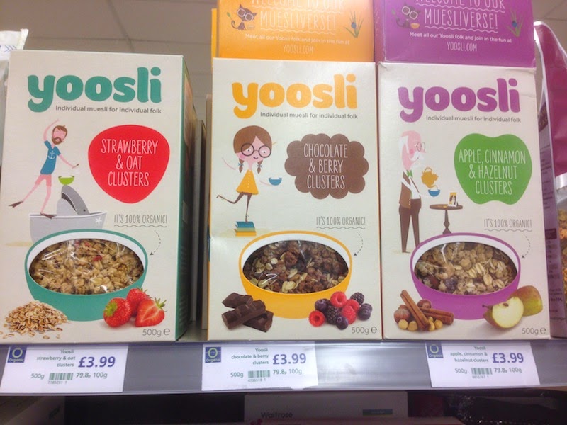
The product is an example of point-of-sale embellishment. The private sector organisation of Yoosli Ltd is selling a product in order to generate profit. Yooslie commissioned the graphic design group Together Design to establish a unique brand identity, which involved the collaboration of the artist Andrew Bannecker to create the individual characters. The product has then been sold to supermarkets such as Waitrose for further distribution to the public.

The product relates to the following services:

.farming industry
.food industry
.distribution
.supermarket industry
.online shopping industry

I would suggest the design successfully communicates the concept of personalisation, as the founder intended. In this sense it has fulfilled it's purpose, however the true test is whether the product itself generates a profit. 


Black Keys poster by Jose Berrio

The poster is an example of promotionally imagery for the private sector band the Black Keys, as a musical group they fall under the jurisdiction of the music industry. The artist was commissioned to promote the groups appearance at a festival event.

The product relates to the following services:

.the music industry
.the printing industry
.the festival industry
.the catering industry
.third sector organisations (such as voluntary festival workers etc)

Again, the product may be seen as successful as it communicates the oceanic scenery of the festival, whilst drawing attention to the headline act. The generic A format has made the printing process seemingly less laborious, and thus more economically viable.


'Korea; Something more' by Hyun Sik Kim 

The Korean Tourism Organisation was commissioned by the Republic of Korea's Ministry of Culture and Tourism to promote tourism in South Korea. A recent campaign included the employment of an illustrator to create a promotional poster to communicate the diversity of Koreas culture to foreigners. 

The product relates to the following services:
.the Ministry of Culture and Tourism (public)
.Korean Tourism Organisation (private)
.the print industry
… all sectors that benefit from visiting tourists

I would suggest the poster isn't particular communicative to a total foreigner, the motifs suggest famous landmarks which are obviously unidentifiable to the common layperson who is yet to visit South Korea. 


Character Designs by Cory Loftis

These visual developments have been made for the private sector company Carbine Studios, the developments are intended for in-house usage as reference for primarily for game developers  such as animators, and modellers, in addition the designs may later be used to prompt voice acting, and in this case to promote the artist.

The product relates to the following services:

.Animation Industry
.Software, computer games and electronic publishing
.Game Industry
.Advertising

The illustration is mostly functional, it has been used as reference for other collaborating creatives, as well as adding to their own portfolio.


                                                     Rear Window Poster by Kevin Tong

These posters are examples of fan-art, the illustrator has self-initiated the project in order to sell prints.
They are for sale on their website, and sold in-person at conventions.

The product relates to the following services:
.(primarily the illustrator)
.events management (such as conventions the illustrator pays to appear at in order to sell)
.the film industry

Although on appearances the product does not exactly spread the wealth around the industries, it is important for practitioners to create work for direct and private transaction, as well as working through clients and other third parties.

To summarise, illustration exists in a variety of contexts, it is used to embellish the products of companies, giving them a unique identity to the ends of creating the impression that their products are better than their competitors. This is achieved by communicating a specific tone of voice through visual language. Illustrators are ultimately private sector workers within the creative industry, they also create work for free in order to spread their prominence within the community and to appease their own aesthetic development. Both public departments and private companies approach illustrators directly, or through a third party such as graphic design companies for commissioning purposes. Ultimately, illustration is another asset to sectors and services to provide healthy commercial competition and to draw the attention of potential consumers.

Friday, 14 November 2014

Student Ambassador: A Claymation

During this session I had the opportunity to make a quick claymation using the models we had created in previous sessions.


Keanu and Patrick from Adam Allsuch Boardman on Vimeo.

Having never done a claymation before I was moderately surprised by how easy it really was. In a relatively short amount of time I created 14 seconds of footage, while I struggled to make 5 seconds using hand-drawn animation.

Friday, 7 November 2014

Student Ambassador: Claymation Figures

Each Thursday I have attended animation workshops as a student ambassador in order to assist the tutor and students. During this session I created a plasticine figure with the intention to make a short animation in future.


 The figure I created was based on Keanu Reeves.


Paisley, another ambassador created the figure on the right, based on Patrick Stewart.

Tuesday, 4 November 2014

PPP2: Brief 2 (Life's a Pitch)

During this session we gathered in pre-arranged groups in order to conceptualise and pitch a fictitious illustrator collaboration. For example; one group had the idea of managing mobile illustration-van which acted as a pop-up shop.

Our group decided to focus on making a high-street presence; a shop not dissimilar to colours may vary, but with a wider variety of goods, such as T-shirts. We also decided that we'd rather run a greasy-spoon-type catering service in-store than a healthy delicatessen or cafe.


Sunday, 2 November 2014

PPP2: Product and Packaging

During an excursion to Waitrose (other supermarkets are available) I documented the more interesting examples of point-of-sale illustration. I went with the understanding that the majority of products are targeted at aspirational middle-class consumers.

I have attached my findings in the form of an issuu presentation (a direct link is available if there are embedding issues).
http://issuu.com/aa108020/docs/packaging?e=10701417/9973555