Monday, 27 April 2015
PPP2: Creative Presence - Developments
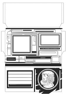
Using the astronaut profile imagery in the previous pack design, I developed a icon using my own face. I am currently conflicted in regards to the textual information present on the front, as I prefer imagery to do the majority of the communication.
While the clean-digital aesthetic has merits, I would prefer not to suggest to recipients of the pack that I am limited to using digital media, thus I would like to involve some additional looser lines in the design.
Tuesday, 21 April 2015
PPP2: A Reply from Ian McQue
I have desired to reach out to various illustrators and ask them about their practice, my initial issue was that I didn't particularly know what to ask them.
However, my work during this module has made me curious how certain practitioners promote themselves.
I sent the follow message to IanM cQue, and got a response from Tracy, who apparently handles the emails.
Hello,
I was wondering whether you used anything physical to promote yourself, such as a promotional pack or business card? If it's possible could I see them?
Thanks.
HI Adam. We don't use anything physical at all for promotional purposes - it pretty much all comes via Twitter and Facebook. We have a small card that we pop in with book orders but it's just our twitter handle, email address and the bigcartel website where we sell the books and prints.
So, sorry - got nothing we can show you physically I'm afraid. Thanks for your interest though.
Tracy McQue
p.p Ian McQue
I would suggest that the large online social following is give the brand of 'Ian McQue' enough momentum to operative without the need of physical promotion, the products alone are enough.
Monday, 20 April 2015
PPP2: Creative Presence - Developments
I have made a second attempt at designing the promotional pack.
I am still unsatisfied with the design, I am finding it particularly difficult to arrange minimal details around a blank white space.
I would like to involve a much greater amount of detail, and perhaps even refrain to a single colour palette.
Saturday, 18 April 2015
Monday, 13 April 2015
Thursday, 2 April 2015
Johnny Hardstaff
I was first made aware of Johnny's work during the advertising campaign for Prometheus. Johnny was the RSA director for the viral films that were used to promote the film. I found that these campaigns were more thematically unnerving than much of the film itself.
It was more recently that I referred to his drawings which are used to pitch ideas. This is obviously highly relevant to my current work in regards to modules that concern with project boards.
The work has a consistent science fiction theme running through it, which is grounded by the technical drawing aesthetic. Each line is drawn cleanly, there is no feathering or messy shading involved. The clear line allows for the designs to be intricate, without being cluttered.
Subscribe to:
Posts (Atom)


