Saturday, 28 December 2013

What is Illustration? Part 2 (Content: Humour)

The Content: Humour

The following examples explore humorous illustrations that I class as successful.


Steve Rogers' American Captain

This expansive web-comic highlights the surreal aspects of modernity, through the eyes of Captain America, as he adjusts to the change of society. It could be argued that the comic has become successful by leeching off a recognisable popular culture icon, but I would suggest that the central themes explored in each issue are real, and human.


Jasper Rietman's TRI/P

These succinct comical shorts endevour to surprise the reader with surreal scenarios. The brevity of the imagery allows a clear joke delivery.


Monster of the Week

In this series Shaenon, has assessed the invariable texts within X-Files through the form of a webcomic. I find the accurate expositional dialogue hilarious as it summaries the weak writing which often let the series down.


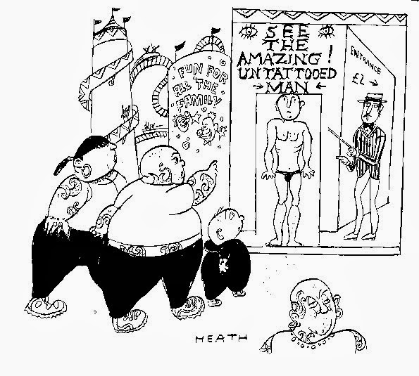
Michael Heath - Private Eye

Heaths' work compliments the patchwork editorial style of the satirical paper, Private Eye. Like many cartoonists, the work is almost exclusively linear and black and white due to printing constraints.


Jim Benton

I have noticed now that a recurring theme with the majority of humorous illustrations is the focus on simplicity… anyway, Jim manages to deliver his joke within two panels or less, this particular example subverts both the invariable text of fairy tales and that of children book illustration, which the aesthetic suggests.

Monday, 9 December 2013

What is Illustration?: Part 2 (Aesthetic: Detail)

The following posts will provide examples of practitioners that correlate to my own practise and interests. I shall make updates as I find more examples.

Aesthetic - The Detailed


The League Of Extraordinary Gentlemen - Kevin O'Neill

The harsh and angular intense detailing effortlessly transitions from the Martian landscape to the industrial smog of London, O'Neill's application of Victorian-like pen and ink drawing is combined with relatively simple colour washes.


Dan Mumford

Quite a lot of Mumford's work is perhaps bafflingly detailed. This is the strongest example of his practise, a clear scene is set the dramatic view-point and colouring contrast add a threat to the event.


Robert Stumpf / Rost Graphics Berlin

Rost has exhaustively documented Berlin to translate atmosphere and space. The method involves editing and tracing his photography. Inevitably this results in the flattening of 3D space. Tone and shade are created with dense pointillist pattern to reduce the amount of screens required during the printing process. I find that the strictly ordered patterns and intentionally balanced colouring helps to create imagery that is dense under close inspection, whilst a holistic view does not become lost in the noise.


David Foldvari

Davids' work often manages to instil Steadman levels of surrealism whilst exercising some level of  restraint. This allows the imagery to have a photographic accuracy, which generally enhances the surreal aspects.


 Mattias Adolfsson

The thick application of detail within Mattias' work is rather astonishing, the work speaks of a dedicated investment of labour and mastery of spacial proportion.