The Content: Humour
The following examples explore humorous illustrations that I class as successful.
Steve Rogers' American Captain
This expansive web-comic highlights the surreal aspects of modernity, through the eyes of Captain America, as he adjusts to the change of society. It could be argued that the comic has become successful by leeching off a recognisable popular culture icon, but I would suggest that the central themes explored in each issue are real, and human.
Jasper Rietman's TRI/P
These succinct comical shorts endevour to surprise the reader with surreal scenarios. The brevity of the imagery allows a clear joke delivery.
Monster of the Week
In this series Shaenon, has assessed the invariable texts within X-Files through the form of a webcomic. I find the accurate expositional dialogue hilarious as it summaries the weak writing which often let the series down.
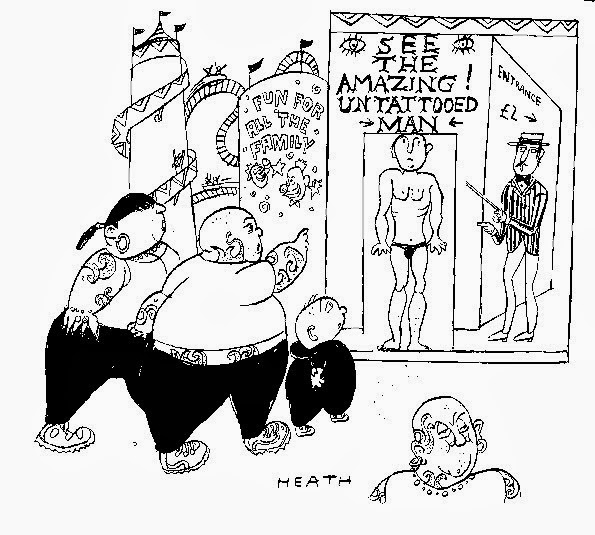
Michael Heath - Private Eye
Heaths' work compliments the patchwork editorial style of the satirical paper, Private Eye. Like many cartoonists, the work is almost exclusively linear and black and white due to printing constraints.
Jim Benton
I have noticed now that a recurring theme with the majority of humorous illustrations is the focus on simplicity… anyway, Jim manages to deliver his joke within two panels or less, this particular example subverts both the invariable text of fairy tales and that of children book illustration, which the aesthetic suggests.
Saturday, 28 December 2013
Monday, 9 December 2013
What is Illustration?: Part 2 (Aesthetic: Detail)
The following posts will provide examples of practitioners that correlate to my own practise and interests. I shall make updates as I find more examples.
Aesthetic - The Detailed
The League Of Extraordinary Gentlemen - Kevin O'Neill
The harsh and angular intense detailing effortlessly transitions from the Martian landscape to the industrial smog of London, O'Neill's application of Victorian-like pen and ink drawing is combined with relatively simple colour washes.
Dan Mumford
Quite a lot of Mumford's work is perhaps bafflingly detailed. This is the strongest example of his practise, a clear scene is set the dramatic view-point and colouring contrast add a threat to the event.
Robert Stumpf / Rost Graphics Berlin
Rost has exhaustively documented Berlin to translate atmosphere and space. The method involves editing and tracing his photography. Inevitably this results in the flattening of 3D space. Tone and shade are created with dense pointillist pattern to reduce the amount of screens required during the printing process. I find that the strictly ordered patterns and intentionally balanced colouring helps to create imagery that is dense under close inspection, whilst a holistic view does not become lost in the noise.
David Foldvari
Davids' work often manages to instil Steadman levels of surrealism whilst exercising some level of restraint. This allows the imagery to have a photographic accuracy, which generally enhances the surreal aspects.
Mattias Adolfsson
The thick application of detail within Mattias' work is rather astonishing, the work speaks of a dedicated investment of labour and mastery of spacial proportion.
Sunday, 17 November 2013
Visual Skills: Module Evaluation
Throughout the module I have consistently documented my progress using the blogs, which have been a beneficial for reflection. By applying documentation skills I have better self-evaluated and improved my work with each new brief. By not spending too much time on rough idea sketches I have freed myself to produce a larger quantity of testing and ideas, which can lead to better resolutions if sufficient development takes place. An instance in which there wasn't sufficient development would be the third brief 'A day in the Life'; I struggled with the form of the panda in an anthropomorphic context. This would have been resolved with more expansive reference study. I did however redraw the image several times and there was a good deal of improvement, but I was not content with the final outcome.
I have sought to formalise the process of idea and concept generation, to do so I have undergone material and tool investigation to expand my knowledge of available processes. By investigating materials and processes I may better remove myself from the familiar and expand my knowledge. Similarly I have begun to apply my ideas to a frame from the initial stages, this helps to prevent my illustrations from becoming
The strongest elements of my work have been the quantity of ideas, though each idea may not be the most well executed or clear, they holistically show a process of improvement and refinement. Another highlight would be my strive for variation, the outcomes for each brief has been quite different in terms of material usage and general aesthetic, though I would say that I have reserved my application of intense detail. The outcome of the brief 'A Matter of Opinion' may appear to be quite dense but I purposely avoided applying nuances of lighting, tone and texture to prevent a visual disarray.
In terms of weaknesses I have not used digital tools often in this module. I consciously avoided photoshop due to familiarity and the desire to expand my use of analogue processes. I should resolve myself to appropriately use it symbiotically with analogue processes rather then neglecting it. The results of material application have not always been high quality, or suitable. In 'Your Initial Brief' I tested the application of ink to create minimal symbolic designs, but eventually resolved the brief using a ball-point pen, thus disregarding the development and falling back on the familiar.
There are areas in which I wish to pursue differently in the next module. I hope to add rigour to my material and tool testing, and better analyse how materials can be used appropriately to aid communication. Furthermore I wish to involve photoshop and illustrator to aid testing and development even if they are not the final point of production. Using digital tools I would also like to look into CAM processes such as laser cutting as well as more traditional equipment like screen printing. I wish to better use reference material in order to improve the technical accuracy of my work. Generally speaking I have not been absent or ill at any time during the module and this has benefitted the quality of work, this in turn has kept my motivation and commitment at a high standard.
Wednesday, 30 October 2013
Sunday, 27 October 2013
Personal & Professional Practice: What is illustration ? - Part 1
In this post I shall give a further five examples for the five criteria which I have chosen to describe my interests in illustration.
The following criteria for illustration that I am most interested in are as follows:
Social/Political
Concept Art
Humour
Detail / Complexity
So that the post does not engulf the entire blog page I shall be inserting a page break after the first five examples.
Social/Political
Leo Tanguma [Denver Airport Murals]
Though the images have been attacked for glorifying a supposed New World Order conspiracy, I applaud the clear expression and strong voice coming from the murals.
Ganzeer, “The Army Above All!” January, 2012
This work effectively highlights the disproportionate violence and corruption which was/is rife during the crisis in Egypt. The use of a limited palette and deep black shading really makes the work bold and powerful.
Unicef China [Ogilvy & Mather]: Don't Ignore Me
Extremely well executed photography highlighting the culture of ignorance.

Cat Staggs
A great parody of American WW2 posters which glorify armed conflict as entertianment.
The following criteria for illustration that I am most interested in are as follows:
Social/Political
Concept Art
Humour
Detail / Complexity
Use of Media & Method of Production
Social/Political
Much of Josephs' work has such pronounced use of angular tone and shape. His work effortlessly reflected the tones of the time he is often cited as a key figure in perpetuating the image of a fat red Santa Claus.
Leo Tanguma [Denver Airport Murals]
Though the images have been attacked for glorifying a supposed New World Order conspiracy, I applaud the clear expression and strong voice coming from the murals.
Ganzeer, “The Army Above All!” January, 2012
This work effectively highlights the disproportionate violence and corruption which was/is rife during the crisis in Egypt. The use of a limited palette and deep black shading really makes the work bold and powerful.
Unicef China [Ogilvy & Mather]: Don't Ignore Me
Extremely well executed photography highlighting the culture of ignorance.

Cat Staggs
A great parody of American WW2 posters which glorify armed conflict as entertianment.
Tuesday, 22 October 2013
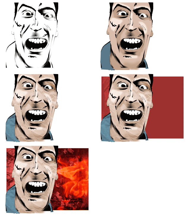
Photoshop Workshop 2 [Colouring and Texturing]
In this session we were instructed how to colourise our scanned imagery. This process requires the manipulation of layers. The below .gif illustrates the order in which I added colouration and texture.

Though this was a quick and relatively simple experiment I find the resulting image quite interesting.
Sunday, 20 October 2013
The Sub-disciplines of Illustration
On Monday we were split at random into blog groups.
Within these small groups we went about deciding how we could divide illustration into subgroups.
Here are five examples for each of the sub-discaplines that we decided upon.
Narrative
Within these small groups we went about deciding how we could divide illustration into subgroups.
Here are five examples for each of the sub-discaplines that we decided upon.
Narrative
The Leeds Steampunk Market
I've been interested in the sub-culture of Steampunk since I read the works of H.G Wells and Jules Verne, it is a growing area with it's own off-shoots and often blurs into the genres of diesel punk and decopunk. However it is the steampunk aesthetic that most are probably familiar with since it began to feature in fantasy and science fiction films such as "20,000 Leagues Under the Sea" in 1954 and more recently, "The Three Musketeers" in 2011.
As I have alluded to, it is an open genre, essentially visualising and ellaborting the science fiction works of the 19th century. This has led to works of outstanding quality and originality as well as some examples of the usual commercialist schlock. Fortunately there were only a few examples of the latter at the market (designers who apparently envisage steampunk as simply adding cogs or brass colouration to modern design).
The vast majority of the work on show was costume or character based, with a hoard of accessories which even I could not resist. I managed to buy a bandolier, having envisaged it's practicality in holding numerous pens. I would surprised at how little work was illustrative based or even concerned with setting and technology. I saw at least four exhibiting illustrators amongst the close to a-hundred stalls.
It was a fantastic experience, especially since the market took place at the Armley Mills and not to mention that practically everyone was dressed appropriately in various steampunk based attires. Perhaps come next year I will be able to exhibit my own work, as I plan to incorporate this genre into more of my work.
I suppose the reason for the growth of this aesthetic is a retaliation against the minimalist movements in technology which have brought about abstract smart phones, tablets and technology which is completely removed from giving the appearance of it's function. Steampunk returns to the roots of technological design, in which functionalist parts are exposed and exaggerated by design.
Why am I here? What do I want to learn?
Why did you chose to study on this program?
- I primarily chose to study at the LCA thanks to my positive experience during the foundation diploma of the same college. I learnt a great deal during that program and I wished to further explore and develop my practice, it seemed logical to remain in Leeds.
- Studying at the LCA has become somewhat of a tradition as I am the third generation to have studied here, I chose to pursue illustration as it best suited my personal interests.
- Illustration has become increasing central to my general practice of making things. Perhaps there was a time when I considered product or prop design, however illustration has proved to be more stimulating. I hope to introduce room for a crossovers over the next few years and beyond.
- Admittedly I was aware that several of the people that I had met during my foundation also hoped to pursue this course. I thought it would be most pleasing to build on the links that had been forged.
- The general prominent reputation of the LCA also fuelled my interest, for it has produced many successful practitioners of the arts. I would finally add that the opportunity to be in the courses' first ever group was too good a chance to pass up.
Dr Grordbort's Infallible Aether Oscillators
A fusion of illustrative design and prop making.
What do you want to Learn during my time on the programme?
- I hope to expand my practice in order to explore new and exciting areas of illustration. The professional format of a degree will certainly do as much and perhaps push me into trying things that I would not otherwise try.
- Crucially I would like to refine my current methods by critically analysing their merits and demerits. Through this process I can strive to be the best sort of illustrator I can be.
- I would gladly like to find out how I can make my work marketable and improve my accessibility to the existing industry. To be able to monetise my work is a key area which I would like to look into.
- Additionally I hope to pursue my own individuality in terms of illustrative practice. As I find that work is greatly improved by the certain presence of uniqueness and genuine personality rather than regurgitated popular culture.
- I have long been fascinated by the impact of historical context. Unfortunately secondary school education did little but focus on key individuals. I rather think that art [and thus illustration] has a wonderful way of evidencing social and political change. Through context of practice I hope to study as such and use it to improve my own work.
What 5 skills are your strengths?
- Without boasting I rather think I have a good attention to the nuances of detail, whilst having the patience and attention to rely such information through my practice.
- I find that pulling out angles and lines in imagery is most aesthetically satisfying, and that this exaggeration can be used to furtively communicate themes.
- I find that my use of biro is quite good, considering it often provokes a positive response as opposed to my other uses of tool. I think it is a particularly under-rated medium, whilst paradoxically been over used by many illustrators.
- Additionally I have a keen ability to pull out contrasting light and dark to create form and allude to depth and texture.
- Over the lest two years I have continually been involved in large collaborative projects in modding communities. Thus I am already familiar with how to work as part of a team and exploiting the specialisations of each member.
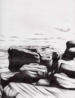
A small section of a biro landscape drawing I did during the summer
What do you want to improve?
- It would be great to decrease my dependance on the medias in which I am [perhaps overly] familiar with. I particularly look forward to improving my use of digital tools and the use of brush-based applications such as oil painting or water colour.
- Hopefully I shall also boost my clarity of communication. I have a record of presuming that my work is plain or obvious, and then becoming frustrated at my lack of foresight.
- I rarely become disinterested in a project, but when it does occur it can drastically impact on the quality of my final piece. I find that a listless visual response is devoid of personality and becomes uninteresting to the viewer.
- It would be most practical to create links to practitioners and gain an insight to the modern industry of illustration. As it stands I have a limited knowledge at best and am quite unequipped to suddenly launch a business or find paying work.
- I am pretty good at drawing the inanimate such as landscapes, buildings and monstrous technological machinery. I would like to become more versed in the study of people in movement.
In what way will you evaluate your progress?
- I shall certainly use this blog in order to critically analyse how successful or unsuccessful my work is. In doing so I can seek to improve my future work.
- Through the use of my sketchbooks I can test and experiment my methods of practice. This involves an ongoing evaluation to improve the quality and clarity of my work.
- With peer reviews I can gain the insight of other students who may work in a similar fashion, or perhaps a completely different methodology. Either way outsider opinions can help centre my evaluative compass and limit my personal bias.
- By seeking the advice of tutors I can take advantage of their generally larger experience in relation to my own and improve my work, or perhaps explore new avenues of practice.
- Formally I will undergo deadlines and feedback which will give me raw information in regards to the success or failings of my work.
Thursday, 17 October 2013
Wednesday, 16 October 2013
Tuesday, 15 October 2013
Photoshop Workshop 1 [Scanning and initial editing]
In this session we were instructed how to make use of the scanners, and the ways in which we could then optimise the work for future editing. The .gif above shows transformation. The example piece has been shot at a poor angle and under an unflattering light. To fix these issues I used perspective transformation, level manipulation and various cropping and selecting methods.
Having satisfactorily got to grips with the process I applied it to my own work as shown below.
Having satisfactorily got to grips with the process I applied it to my own work as shown below.
Wednesday, 9 October 2013
Subscribe to:
Posts (Atom)


